How to Use the Daily Report Dashboard in Standupify
The Daily Report Dashboard in Standupify provides a visual summary of team and individual task progress. Follow these steps to access and effectively utilize its features for monitoring planned versus completed tasks.
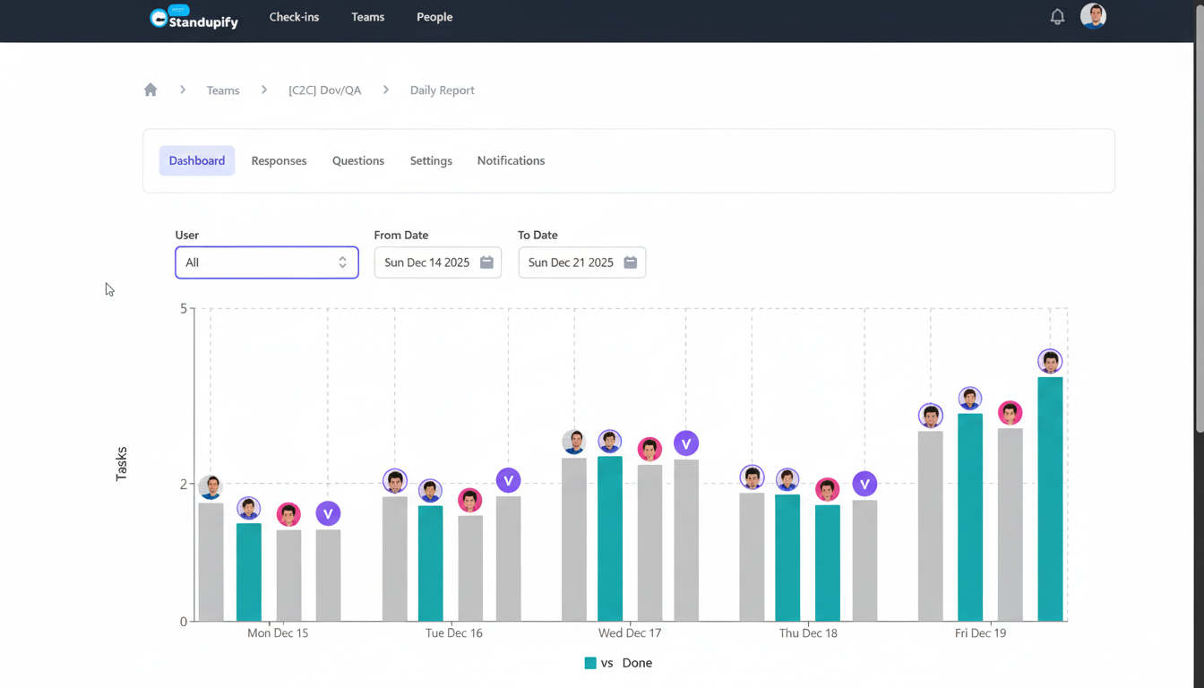
Accessing and Using the Daily Report Dashboard
- Navigate to Check-ins: From the top global navigation bar in the Standupify web application, click on "Check-ins".
- Select Your Team: In the sub-navigation, choose "Teams" and then select the specific team you wish to view (e.g., "[C2C] Dov/QA").
- Go to Daily Report: Click on "Daily Report" in the breadcrumbs or sub-navigation.
- Activate Dashboard Tab: Ensure the "Dashboard" tab is active to view the visual report.
- Filter by User: Use the "User" dropdown menu to filter the report. You can select "All" users to see aggregated team data or choose a specific team member to view their individual progress.
- Adjust Date Range: Utilize the "From Date" and "To Date" calendar selectors to define your desired reporting period. For example, you can select a week from "Sun Dec 14 2025" to "Sun Dec 21 2025".
- Interpret the Bar Chart: Observe the bar chart, which visually represents "planned" tasks (labeled "vs" in teal) and "completed" tasks (labeled "Done" in gray) for each day within the selected period. The Y-axis indicates the number of tasks, and the X-axis displays the days (e.g., 'Mon Dec 15', 'Tue Dec 16'). User avatars are displayed above some bars, providing a quick visual reference for individual contributions.
This dashboard allows you to quickly compare task dynamics over a selected period and analyze the performance of different team members, helping you identify trends in task completion and foster accountability.
Frequently asked questions
How do I filter the Daily Report Dashboard by a specific user or date range?
You can filter the dashboard using the 'User' dropdown to select 'All' users or a specific team member, and by adjusting the 'From Date' and 'To Date' calendar selectors to define your desired reporting period.
What do the 'vs' and 'Done' bars represent in the chart?
The 'vs' (teal) bars represent tasks that were planned or assigned for a given day, while the 'Done' (gray) bars show tasks that were completed and reported through the Standupify Google Chat bot.
How can I see an individual's task completion rate?
To view an individual's task completion, use the 'User' dropdown filter to select their name. The dashboard will then display their planned versus completed tasks for the selected date range.
How can I identify trends in task completion?
By adjusting the date range, you can observe the patterns of 'planned' versus 'done' tasks over time. This helps in identifying consistent completion rates, bottlenecks, or periods of high productivity.